A whole-house color scheme is the difference between a home that feels pulled together and one that looks like five different Pinterest boards collided. When each room relates to the next through a thoughtful color strategy, the entire house feels larger, calmer, and more intentional, even if the actual paint job happens room by room over months. This isn’t about painting everything beige or committing to one color forever. It’s about creating a flexible palette that works across trim, walls, cabinets, and fixed finishes, then adapting it as the homeowner moves through each space. Done right, a cohesive color plan makes future decorating decisions faster and helps resale value by presenting a unified, well-maintained home.
Table of Contents
ToggleKey Takeaways
- A whole-house color scheme creates visual flow and makes homes feel larger, calmer, and more intentional by using 3-5 coordinated colors across connected spaces.
- Starting with fixed elements like hardwood floors, countertops, and brick fireplaces helps establish anchor colors for your entire house color schemes.
- Selecting one primary neutral (warm white, greige, or soft gray with LRV 50-70) paired with bright white trim (LRV 85+) and 1-2 accent colors ensures cohesion and resale appeal.
- Test paint colors with large 2×2-foot swatches in both natural and artificial light for at least 24 hours, as lighting and undertones dramatically affect how colors read on walls.
- Use consistent trim, ceiling, and finish types throughout the home to maintain visual continuity and avoid the choppy appearance of mixed paint finishes.
- Keep accent colors for private or destination rooms (bedrooms, bathrooms, offices), while using primary neutrals in high-traffic areas like entryways, hallways, and living rooms.
Why a Whole-House Color Scheme Matters
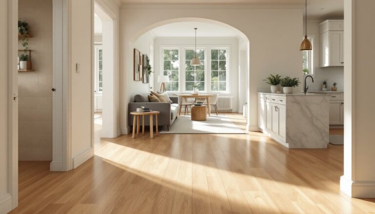
Visual flow matters more than most DIYers realize. When someone walks from the entryway through a hallway into the kitchen, their eye registers each color transition. Abrupt shifts, bright yellow to navy to terracotta, create visual friction and make spaces feel choppy and smaller. A cohesive palette doesn’t mean monotonous. It means selecting a core set of 3-5 colors that appear in varying proportions throughout the home, letting one dominate in the living room, another in the bedrooms, and a third as an accent.
Practically, a whole-house scheme saves money and time. Instead of buying six different gallons of white trim paint over the years (each slightly different), the homeowner selects one trim color and reuses it everywhere. This also simplifies touch-ups and future repaints. One gallon of quality interior paint typically covers 350-400 square feet with one coat, so standardizing colors means less waste and fewer half-empty cans cluttering the garage.
From a resale perspective, cohesive color increases perceived value. Buyers notice when a home feels intentional. They’ll overlook dated tile or an older kitchen if the color story is clean and neutral. Conversely, a house with lime green in the bathroom, red accent walls in the dining room, and builder beige everywhere else telegraphs deferred maintenance and indecision, even if the bones are solid.
How to Choose Your Primary Color Palette
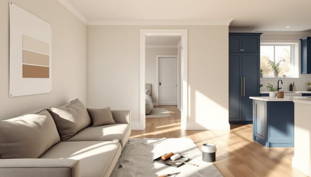
Start with the elements that aren’t changing. If the home has hardwood floors, tile backsplashes, granite countertops, or brick fireplaces, those are fixed anchors. Pull paint chips that complement or contrast intentionally with those finishes. A home with warm oak floors and honey-toned cabinets will fight cool grays: instead, lean into warm neutrals, greiges, or soft whites with a cream base.
Select one primary neutral for the majority of walls. This is typically a warm white, greige, or soft gray in the LRV (Light Reflectance Value) range of 50-70, which reads as light but not stark. Pair that with one trim and ceiling color, many homeowners default to a bright white (LRV 85+) like Benjamin Moore’s Chantilly Lace or Sherwin-Williams’ Pure White for trim, doors, and ceilings. That high-contrast trim makes rooms feel taller and more finished.
Add one or two accent colors for flexibility. These can be deeper, moodier tones (navy, forest green, charcoal, terracotta) used in a single room, on a feature wall, or for built-in cabinetry. The key is that accent colors share an undertone with the primary neutral. If the neutral is a warm greige, accent colors should also have warm undertones: cool-toned accents will clash.
Test every color on-site. Paint large swatches, at least 2′ x 2′, on multiple walls in each room and observe them over 24 hours. Natural light, bulb color temperature (measured in Kelvin, with 2700K warm and 5000K cool), and adjacent finishes all shift how a color reads. A greige that looks perfect in the store might read purple at dusk or green against oak trim.
Consider building codes and safety if painting stairs, railings, or exterior trim. While interior color is purely aesthetic, exterior paint must withstand UV exposure and moisture. If the project includes painting trim or doors that are part of egress routes, confirm that finishes meet local fire and safety standards, especially in multifamily or rental properties.
Popular Entire House Color Scheme Styles
Choosing a style helps narrow down thousands of paint chips into a manageable shortlist. These categories aren’t rigid, but they provide a starting framework.
Warm and Earthy Neutral Palettes
This approach uses beiges, warm grays (greiges), taupes, soft creams, and off-whites with yellow, red, or brown undertones. It pairs well with wood trim, natural materials, and traditional or transitional furnishings. Think Sherwin-Williams’ Accessible Beige, Benjamin Moore’s Revere Pewter, or Farrow & Ball’s Skimming Stone.
Warm neutrals make homes feel cozy and grounded. They’re forgiving with varied lighting and work across open floor plans where the kitchen flows into the living room. Homeowners exploring budget home makeovers often start here because these colors age well and appeal to a wide audience.
Accent colors in warm neutral schemes include terracotta, ochre, olive, rust, and warm charcoal. These can appear in a powder room, a study, or as a feature wall behind a bed. Avoid pure white trim with warm neutrals: instead, use a warm white or cream (like Benjamin Moore’s White Dove) so the trim doesn’t fight the walls.
Cool and Contemporary Schemes
Cool schemes rely on true grays, soft blues, greiges with blue or green undertones, and crisp whites. They suit modern, minimalist, and Scandinavian interiors and pair well with stainless steel, concrete, and white or black cabinetry. Examples include Sherwin-Williams’ Repose Gray, Benjamin Moore’s Gray Owl, or Behr’s Silver Drop.
Cool palettes make spaces feel airy and clean, but they can read stark or institutional if not balanced with warm textures (wood, linen, brass). Lighting is critical, LED bulbs at 3000K help soften cool grays, while 5000K daylight bulbs can make them feel clinical.
Accent colors here include navy, charcoal, sage green, dusty blue, and matte black. These work well in studies, dining rooms, or on kitchen islands. For homes with abundant interior design inspiration, cool schemes offer a gallery-like backdrop that lets art and furnishings stand out.
Trim in cool schemes is typically bright white (LRV 85+), which creates sharp, modern contrast. If the home has warm wood floors, consider a slightly warmer white to bridge the gap, or embrace the contrast deliberately.
Applying Your Color Scheme Room by Room
Once the palette is chosen, map it out room by room, keeping the primary neutral consistent in high-traffic and connecting spaces (hallways, entryway, living room). These areas benefit from continuity. Accent colors can appear in private or destination rooms, bedrooms, bathrooms, home offices, where a door provides a visual break.
Entryway and hallways: Use the primary neutral on walls and the trim color on all doors, baseboards, and crown molding. This creates an immediate sense of cohesion. If the home has an open floor plan, carry the same wall color into the living room and kitchen to eliminate awkward transitions.
Living and dining rooms: Stick with the primary neutral or introduce a slightly deeper shade (one or two steps darker on the paint strip). If there’s a fireplace, consider painting the surround or built-ins in an accent color. Keep trim consistent.
Kitchen: Walls typically stay neutral, but this is a strong candidate for an accent color on an island or lower cabinets. Popular choices include navy, forest green, or charcoal. Ensure the color doesn’t clash with countertops or backsplash. If painting cabinets, use a bonding primer (like INSL-X Stix or Zinsser B-I-N) and a durable topcoat such as Benjamin Moore Advance or Sherwin-Williams Emerald Urethane. Cabinet painting is cosmetic but demands prep, deglossing, sanding, and multiple thin coats are non-negotiable.
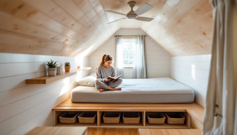
Bedrooms: These are safe zones for deeper or moodier accent colors, especially in primary suites where the door closes. A charcoal feature wall, a soft sage, or a dusty blue can add personality without disrupting the home’s overall flow. Keep trim and ceilings consistent with the rest of the house.
Bathrooms: Small bathrooms benefit from the primary neutral to keep them feeling open. Larger bathrooms or powder rooms (which are often doorless off hallways) can handle an accent color. Just ensure the color doesn’t cast unflattering tones on skin, avoid strong greens or cool blues near mirrors.
Ceilings: Most ceilings should be bright white (LRV 85+). In rooms with very high ceilings (10’+), a slightly tinted ceiling (matching the wall color at 50% saturation) can make the space feel cozier without looking dingy. Always use a flat or matte finish on ceilings to hide imperfections.
Tips for Maintaining Flow and Avoiding Common Mistakes
Keep trim and ceiling colors consistent throughout. Switching from white trim in the living room to cream trim in the bedrooms breaks the visual thread and makes the home feel choppy. Order enough trim paint upfront, one gallon covers roughly 400 square feet, so measure all baseboards, door casings, and window trim before buying.
Use the same finish in similar spaces. Flat or matte works for low-traffic adult spaces: eggshell or satin (10-25% sheen) is more durable for hallways, kids’ rooms, and kitchens. Don’t mix finishes randomly, shifting from flat to semi-gloss within the same room looks unintentional.
Account for undertones in every sample. A “gray” can have blue, green, purple, or brown undertones that only show up on the wall. If uncertain, compare the sample against a piece of pure white printer paper. The difference reveals the undertone.
Test colors in both artificial and natural light. A color that looks perfect at noon might turn muddy at dusk under warm incandescent or LED bulbs. Paint samples and live with them for at least 24 hours before committing.
Don’t skip prep. Wash walls with TSP (trisodium phosphate) or a degreaser, fill nail holes with spackling compound, sand rough spots with 120-grit sandpaper, and prime any stains or dark colors with a stain-blocking primer like Zinsser B-I-N or Kilz Max. Skipping prep is the #1 cause of peeling, bleed-through, and poor coverage.
Document everything. Keep a spreadsheet or note card with the brand, color name, and finish for every paint used in each room. This makes touch-ups and future repaints effortless. Store leftover paint in a cool, dry location (not a garage subject to freezing) with the lid tightly sealed. Paint lasts 2-10 years depending on storage conditions.
Avoid trendy accent walls unless committed to repainting. Bold colors date quickly. If experimenting, choose a small, low-visibility space first. Many DIYers who’ve tackled room makeovers recommend testing bold colors in a closet or laundry room before committing to a main living area.
Recognize when to call a pro. If the project involves lead paint (homes built before 1978), tall ceilings requiring scaffolding, or exterior surfaces needing pressure washing and caulking, hire a licensed painter. Lead abatement requires EPA-certified contractors. Exterior paint also demands attention to weather and temperature, most paints require application between 50-85°F with low humidity for proper curing.
A cohesive whole-house color scheme isn’t about perfection. It’s about creating a flexible framework that makes each subsequent decision easier, whether that’s picking a throw pillow or planning the next repaint. Stick to a handful of well-chosen colors, test them thoroughly, prep surfaces properly, and the house will feel pulled together, no designer required.